What’s in an icon?
Barbara Douglas from the Elder Council of Newcastle and judge of our age-positive icon competition guides us through the process of how the winning designs were chosen.
In September 2020, Ageing Better – supported by Public Health England (PHE) – launched a free online competition to rethink the symbols and icons commonly used in public to represent ageing and older age groups. Barbara Douglas was invited to join the panel to choose the winning design.
I was delighted to be invited to be part of the Centre for Ageing Better’s panel and excited to see how designers would ‘reinvent’ the icon we have all learned to hate.
As the designs came through, I quickly realised what an impossible challenge it is. How can you create an icon that reflects a 50+ year age-span? Do you either annoy those who are less mobile by showing people who are fit and active? Or annoy those who are fit and active by portraying them with walking sticks that they would never use? Or do you try to avoid all those pitfalls and come up with something that doesn’t really mean anything to anyone? It was noticeable that in trying to avoid these pitfalls, some of the designs turned out to incorporate all the stereotypes we were trying so hard to avoid.
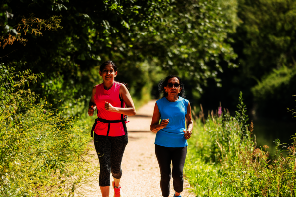
Given the diversity of later life, it feels fitting that Ageing Better have launched not just one but a whole suite of icons – depicting older people in situations from gardening to using the computer.
As a panel, we quickly dismissed the idea that we need a street sign, alerting drivers to the fact that there are older people about. Where would you put it? Why not just make sure that we have speed limits and adequate crossing times that would work for us all, no matter what our age. However, we could see value in an icon which could be used for public information denoting that the information particularly applies to older people. We also liked the idea of an icon we could use on publications.
During our Zoom judging session, we groaned and laughed and shared our likes and dislikes. In the end, we were all able to agree on this winning design:
The things I liked about this design are: The body shapes clearly show that they are older people without the older woman needing a bun, which featured in so many of the designs; There is a man and a woman, but they are not necessarily a ‘couple’ – getting away from the stereotype that if you are older, you must be in a heterosexual couple!
They are having fun and, importantly, they are breaking out of the triangle which, to me symbolised breaking through the barriers of ageism and creating a new narrative on ageing.
My favourite of the shortlisted designs is this one:
It made the judging by the skin of its teeth and the designer wrote: ‘This piece is called I’m off and it represents that older people are free, busy and onto the next thing. They are leaving the stereotype images of ageing behind.’ I laughed out loud and it reminded me the active members of Elders Council who never have a moment to spare!
Given the diversity of later life, it feels fitting that Ageing Better have launched not just one but a whole suite of icons – depicting older people in situations from gardening to using the computer. We hope that these images will help people to break out of the stereotypes of later life and see ageing in new ways.